The Penn World Tables are one of the greatest source of worldwide macroeconomic data, but dealing with its web interface is somewhat cumbersome. Fortunately, the data is also available as a R package on CRAN. Having some tools at hand to quickly draw some nice graphs from the data is useful in many circumstances. Here are three exciting packages that help you to quickly explore the PWT data in R. All of them are on CRAN.
First, get the data (in PWT 8, you need to calculate per capita measures yourself):
library(pwt8)
pwt8.0$cap <- pwt8.0$rgdpe / pwt8.0$pop
1. ggplot2
Use ggplot2 to draw time series for a variable. Exchange the isocodes in the list or the variable name to alter the graph.
library(ggplot2)
dta <- subset(pwt8.0, isocode %in% c("USA", "JPN", "KOR", "CHN"))

qplot(dta$year,
      dta[, 'cap'],
      geom = "line",
      group = dta$isocode,
      color = as.factor(dta$isocode)
     ) +
theme(legend.title = element_blank()) +
scale_y_log10()
and that’s what you will get:
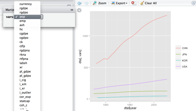
2. manipulate
Use ggplot2 and manipulate to be even more flexible. (You need RStudio for that, but you should have it anyway!)
library(manipulate)
dta <- subset(pwt8.0, isocode %in% c("USA", "JPN", "KOR", "CHN"))

manipulate(
  qplot(dta$year,
        dta[, vars],
        geom = "line",
        group = dta$isocode,
        color = as.factor(dta$isocode)
       ) + theme(legend.title = element_blank()),
 vars = picker(as.list(colnames(pwt8.0)[-(1:3)]))
)
you will get a nice menu to choose the variable of your interest.
3. googleVis
googleVis let’s you use the Google Visualisation API.
library(googleVis)
First, get some pretty colors from colorbrewer2.org:
colorbrewer <- "{maxValue: 40000, colors:['#F7FCF0', '#E0F3DB', '#CCEBC5', '#A8DDB5', '#7BCCC4', '#4EB3D3', '#2B8CBE', '#0868AC', '#084081']}"
And now draw a map with your data (make a screenshot if you want to use it)
plot(gvisGeoChart(subset(pwt8.0, year == 2011), "country", "cap",
                   options=list(colorAxis = colorbrewer)))
That’s the result:
Or simply show all data, in a very similar way as the Google Public Data Explorer does.
plot(gvisMotionChart(pwt8.0, idvar="country", timevar="year")))


A gift from heaven!
Superb work
Thank you very much
Pingback: Momento R do Dia (dica) | De Gustibus Non Est Disputandum