The Spring Festival is the most important holiday in China and many other Asian countries. Traditionally, the holiday starts on Chinese New Year’s Eve, and lasts to the Lantern Festival on the 15th day of the first month of the lunisolar calendar. The Chinese New Year is celebrated either in January or in February of the Gregorian calendar.
Because of its importance, Chinese New Year seriously distorts monthly time series, which are usually reported according to the Gregorian calendar. Unlike Easter, Chinese New Year does not affect quarterly time series, as it always falls in the first quarter.
The standard software packages for seasonal adjustment, X-12-ARIMA and X-13-ARIMA-SEATS (developed by the U.S. Census Bureau) or Tramo Seats (developed by the Bank of Spain) have a built-in adjustment procedure for Easter holiday, but not for Chinese New Year. However, all packages allow for the inclusion of user defined variables, and the Chinese New Year can be modeled as such.
The R package seasonal
With the R package seasonal, generating and including such a series is easy. We will use it in the following to seasonally adjust and remove Chinese New Year effects from the nominal dollar value of imports to China. seasonal is an interface to X-13ARIMA-SEATS; for more information and installation details, see here.
Chinese imports are included as an example series in seasonal. As the series has a very different seasonal pattern before 2000, we focus on the later period. (Adjusting the whole series in one step is possible, but for good results one should manually model the seasonal break.)
library(seasonal)
data(cntrade)  # contains imports ('imp') and exports ('exp') of China
imp <- window(imp, start = 2000)  # this shortens the series
seasonal includes the genhol() function, a R version of the equally named software utility by the U.S. Census Bureau. Using the dates of the Chinese New Year as an input, it produces a time series with the deviations from the monthly means. Here we are assuming that the holiday starts on New Year’s Eve and lasts for one week.
data(holiday)  # dates of Chinese New Year and Easter, included in seasonal
cny.ts <- genhol(cny, start = -1, end = 6, center = "calendar")
In 2014, only two days in January were affected by the holiday (New Year’s Eve and New Year’s Day). 75% of the holiday fell into February. Thus, January was affected slightly less than average, February slightly more. This is very different from 2012, when the holiday completely fell into January.
       Jan   Feb   Mar   Apr   May   Jun   Jul   Aug   Sep   Oct   Nov   Dec
2011 -0.26  0.26  0.00  0.00  0.00  0.00  0.00  0.00  0.00  0.00  0.00  0.00
2012  0.74 -0.74  0.00  0.00  0.00  0.00  0.00  0.00  0.00  0.00  0.00  0.00
2013 -0.26  0.26  0.00  0.00  0.00  0.00  0.00  0.00  0.00  0.00  0.00  0.00
2014 -0.01  0.01  0.00  0.00  0.00  0.00  0.00  0.00  0.00  0.00  0.00  0.00
Including user defined regressors
The time series cny.ts can be included in the main seasonal adjustment. The automated procedures of X-13ARIMA-SEATS can be applied to the imp series in the following way:
m1 <- seas(imp, xreg = cny.ts, regression.usertype = "holiday", x11 = list()) summary(m1)## ## Call: ## seas(x = imp, xreg = cny.ts, regression.usertype = "holiday", ## x11 = list()) ## ## Coefficients: ## Estimate Std. Error z value Pr(>|z|) ## cny.ts -0.18104 0.01548 -11.70 < 2e-16 *** ## Weekday 0.00514 0.00104 4.94 7.8e-07 *** ## LS2008.Nov -0.37584 0.04745 -7.92 2.3e-15 *** ## MA-Nonseasonal-01 0.39776 0.07202 5.52 3.3e-08 *** ## MA-Seasonal-12 0.72749 0.06428 11.32 < 2e-16 *** ## --- ## Signif. codes: 0 '***' 0.001 '**' 0.01 '*' 0.05 '.' 0.1 ' ' 1 ## ## ARIMA structure: (0 1 1)(0 1 1) Number of obs.: 169 Transform: log ## AICc: 1.6e+03, BIC: 1.62e+03 QS seas. test (adj. series): 0 ## Box-Ljung (no autocorr.): 33.6 . Shapiro (normality): 0.978 **
With xreg, arbitrary user defined regressors can be included, regression.usertype = "holiday" ensures that the final series does not include the regression effect. We also have chosen X11 as the decomposition method.
Unsurprisingly, the summary reveals a highly significant Chinese New Year effect. As the automatic model has been estimated on the logarithmic series, the coefficient of -0.18 indicates that New Year in 2012 has lowered imports by approximately 0.74 * 18 = 13%. The automatic procedure has also detected weekday effects and a level shift during the financial crisis.
Multiple regressors
We can do even better by using more than one user defined regressors, one for the pre-New-Year period and one for the post-New-Year period (thanks, Freya Beamish):
pre_cny <- genhol(cny, start = -6, end = -1, frequency = 12, center = "calendar") post_cny <- genhol(cny, start = 0, end = 6, frequency = 12, center = "calendar") m2 <- seas(x = imp, xreg = cbind(pre_cny, post_cny), regression.usertype = "holiday", x11 = list()) summary(m2)## ## Call: ## seas(x = imp, xreg = cbind(pre_cny, post_cny), regression.usertype = "holiday", ## x11 = list()) ## ## Coefficients: ## Estimate Std. Error z value Pr(>|z|) ## pre_cny 0.070843 0.019199 3.69 0.00022 *** ## post_cny -0.241043 0.020816 -11.58 < 2e-16 *** ## Weekday 0.005233 0.000943 5.55 2.9e-08 *** ## LS2008.Nov -0.357887 0.045790 -7.82 5.5e-15 *** ## MA-Nonseasonal-01 0.331626 0.073967 4.48 7.3e-06 *** ## MA-Seasonal-12 0.687479 0.065740 10.46 < 2e-16 *** ## --- ## Signif. codes: 0 '***' 0.001 '**' 0.01 '*' 0.05 '.' 0.1 ' ' 1 ## ## ARIMA structure: (0 1 1)(0 1 1) Number of obs.: 169 Transform: log ## AICc: 1.59e+03, BIC: 1.61e+03 QS seas. test (adj. series):0.75 ## Box-Ljung (no autocorr.): 37.6 * Shapiro (normality): 0.984 *plot(m2)
There are actually two kind of New Year effects: Until New Year’s Eve, import activity is higher than usual. During the holiday, it is lower. By including two regressors, these opposite effects can be modeled. Note that the negative effect is more pronounced than the positive one.
Manual refinements
The model could be further refined. With the static() function, a non-automatic version of the previous call can be extracted. It can be copy-pasted and used for further manipulations.
static(m2)## seas(x = imp, xreg = cbind(pre_cny, post_cny), regression.usertype = "holiday", ## x11 = list(), regression.variables = c("td1coef", "ls2008.Nov" ## ), arima.model = "(0 1 1)(0 1 1)", regression.aictest = NULL, ## outlier = NULL, transform.function = "log")
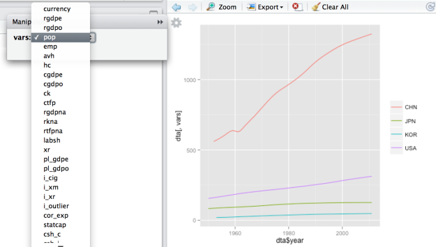
The inspect() function opens an interactive window that allows for the manipulation of a number of arguments. With each change, the adjustment process and the visualizations are recalculated. (This only works with R Studio.)
inspect(m)
After some playing around, we would probably stay with the two regressor adjustment model from above:
m2 <- seas(x = imp, xreg = cbind(pre_cny, post_cny), regression.usertype = "holiday",
           x11 = list(), regression.variables = c("td1coef", "ls2008.Nov"),
           arima.model = "(0 1 1)(0 1 1)", regression.aictest = NULL,
           outlier = NULL, transform.function = "log")
It’s far form perfect. Normality statistics are bad, and there may be some traces of autocorrelation. On the other hand, the seasonal component is stable and revisions are small.
Comparing the series
Was it worth the pain? The following graph shows the same seasonal adjustment with and without the Chinese New Year adjustment:
m3 <- seas(x = imp, x11 = list(), regression.variables = c("td1coef", "ls2008.Nov"),
           arima.model = "(0 1 1)(0 1 1)", regression.aictest = NULL, outlier = NULL,
           transform.function = "log")

ts.plot(diff(log(cbind(final(m2), final(m3)))), col = c("red", "blue"),
        lwd = c(2, 1))
In 2012, we would have concluded that imports have plumped in January, soared in February and plumped again in March (blue line). With the adjustment, we rightly conclude that there was no such craziness (red line).
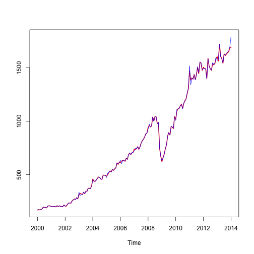
ts.plot(final(m2), final(m1), col = c("red", "blue"), lwd = c(2, 1))
How useful is the two regressor model? Most of the time, the single regressor model performs reasonably well and leads to results similar to the two regressors model. This year, however, the Lunar New Year fell on January 31. As people were importing more in the pre-New-Year period, January imports were actually affected by a positive New Year effect. The right adjustment would be to correct the numbers downward! With the one regressor model, we would wrongly conclude that imports have soared (blue line). In fact, they have actually stagnated (red line).


